Who Shot the Serif?

Okay I admit, I didn’t make that joke up.  But I like it so I’ll “repost” it.

My recent post on cursive got me thinking about text again.  In it, I briefly mentioned the common knowledge that sans-serif fonts were supposedly easier to read on a digital medium, whereas serif fonts were better in their printed form.  Of course, the CSS class I had taken once also touted an ideal single-line character limit as the easiest to read.  I was skeptical at the time, and talked about how to override the default WordPress line limit.  Now, staring at what I consider to be a juvenile-looking default sans-serif font, I decided that needed changing too.  In short–the Internet is wrong and I have to take matters into my own hands.

And so, you might have noticed that the fonts on this site are different now.  After some trial and error, I decided upon “Freight Text”, based on nothing more than the fact that I found it the most visually pleasing.

I have no idea who develops fonts and what’s involved with the process of their standardization.  That’s a topic for another day’s adventure through the interwebs.  But I found this brief description:

“About Freight Text

Phil’s Fonts evolved from one of the most well known and respected photolettering studios in the industry – Phil’s Photo. We carry on the traditions and standards established by its founders. As the state of typography changes in the digital era, Phil’s Fonts continues its love affair with beautiful faces, making fine typography available to artists and communicators around the world.”

Apparently there’s some studio that makes these and people decide whether or not to adopt them?  Whatever

Regardless, if you don’t have the font installed, your browser will revert to its default serif font:

    {
font-family: “Freight Text”, serif;
color: #000000;
}

And that’s it, really.  I changed the CSS for a number of elements.  Sure, fonts might be a pointless argument, but in this specific instance, I’d rather choose a more sophisticated-looking variant over its overly-simplified modern counterpart.

–Simon

Penmanship

I’ve always fancied cursive.  However, my contemporaries, as well as my teachers, hated it.  Yet, it remained in the curriculum back in the early 90s regardless.  And while it might now be falling into the myriad of lost/obsolete skills, I refuse to let it die completely.

Amusingly, because so many have written it off (hehe), so few are able to readily even read it.  I’ve even been asked on occasion to stop.  But I look back on my college years and note that none of my professors ever had the slightest hint of difficulty reading my writing, and were it not for my adeptness with the seemingly ancient script, those lengthy hand-written final exam essays would have been much more difficult.  So I say unto these people: No!  Learn how to read!

But many today too predict the impracticality of modern higher education–that it will collapse under its own unsustainability and become less higher, and more vocational.  College, like cursive, will become an academic relic.

Apparently, I can be pompous and nihilistic.  That seems to suit me.

The irony of blogging about handwriting is not lost on me, and I still on occasion relish the pure analog methods.  And in this I am certainly not alone, for I listened to a recent podcast that discussed the history of penmanship at length.  The host (approximately my age) mentioned that he had been taught the D’Nealian method, and this got me curious, for I had never considered the type of cursive that I use.  It seemed like a good time to find out.

So I took a sample of my writing for the base comparison:
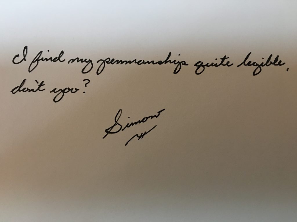
In an attempt to remove bias (which I’m sure isn’t perfect), I wrote a sentence as automatically as possible, so as to preserve the natural form of the letters.  Then I compared it to the D’Nealian alphabet:

It didn’t seem quite the same, so I wrote out the alphabet as I would normally make the letters:
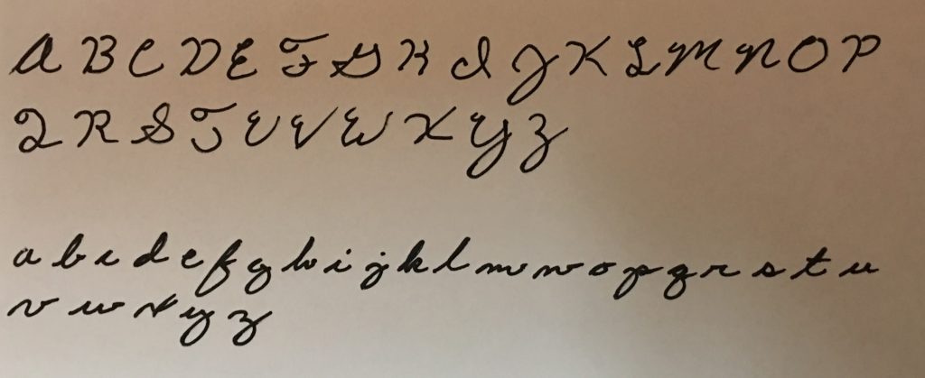
There were a lot of similarities, but it wasn’t quite the same, mostly in my upper case characters.  Mine had more loops and flair.  I wondered why that was?  I doubt that’s something I would have picked up on my own, so where did it come from?  Time to dig further back.

D’Nealian was apparently an attempt to ease the transition between cursive and print.  Prior to this, we had Zaner-Bloser.

There appeared to be variations with Zaner-Bloser, and most of the modern samples I found strongly resembled D’Nealian, but I did find this sample, which included the loops that I use:

In fact, it used more loops than I use.  So it would appear that I was taught during some transitional period wherein I developed a Zaner-Bloser/D’Nealian hybrid.  But from where did Zaner-Bloser orginate?

Apparently, from the Palmer Method:

Palmer varied significantly from my method–not just in loops, but is some examples of fundamental character structure, notably the F, R, and T.

And just to complete this line of inquiry, I dove back one iteration further–Spencerian:
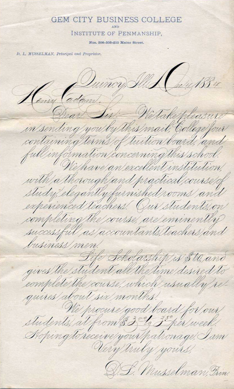
Spencerian was ridiculously loopy, and even incorporated shading accents.  It was an obvious predecessor, but certainly nothing that would be taught in gradeschool.

I conclude then, that my cursive writing style is founded on Plamer, which had been modified into Zaner-Bloser.  But at some point in my learning, the style had changed to D’Nealian.  I do recall at one point there being a discussion with my teacher that I was using unsanctioned loops, which I specifically recall having been previously taught to use, so there was apparently no formal cutoff between the two styles, and I had been taught both–ultimately resulting in the hybrid style I use today, which might be fairly unique in its own right.

The modern equivalent is the evolution of fonts.  Monospaced fonts, created for efficiency and their lack of computing resource demand, gave way to variable-width serif fonts, which were created to be easier to read in print, which gave way to sans-serif fonts, supposedly easiest to read on the variety of modern computer screens.  At one point I was instructed to type all manuscripts in size 12 Times New Roman–a variable-width serif font–yet the standard now is Arial.  Who knows–maybe one day someone 10-20 years my junior will lament on the passing of serif fonts much the way I’m lamenting now on the obsolescence of handwritten cursive.

In loving memory
Cursive

–Simon

Cold and Snowy

In my opinion, once the holidays are over, it should warm up instantly.  In reality, however, it never snows and gets truly cold here until the end of January–the point at which everyone’s tired of the cold and wants to go outside again.

So with no outdoor projects immediately available to me, here’s a list of what I did last January:

Yep–that seems like an appropriate list for January.  Tune in May.  I should have something interesting to write about then.

–Simon

Forced Childhood

Every artist has their medium.  Snow is not my daughter’s.  My theory (based on the current state of her basement art studio), is that snow is too monochrome (#FFFFFF is sooo pedestrian).

Yet this irritates me, probably due to my own childhood memories.  Texas didn’t offer much in the way of snow, and as our culture as a whole is heavily influenced by the Midwest and New England and their associated images of holiday blizzards, Christmas time always carried with it a bit of melancholy as I peered out the window across a wind-swept and barren Dust Bowl landscape.  I never once rode a sled in my childhood, and on only one notable occasion do I remember building a snowman (to which my dad added breasts, followed by mom administering a mastectomy via garden trowel).

I am NOT having fun

But the joke’s on this youngest generation.  Climate change will either warm the region beyond the point of regular snow, or cool it to the point that it destroys us.  Either way, those quaint Rockwellian scenes will vanish alongside the planet’s biodiversity.  And I, Dad, will mock my child for her youthful indifference.

–Simon

Football Conversations

As a non-football watcher, I’ve spent many a conversation pretending to have watched something I didn’t, or to care about something I don’t, and to use grammatically unsound complex sentences of negation.

At first, I would maintain the charade as football fans, when discussing football, are complete conversational narcissists, and would never notice that I wasn’t adding anything meaningful to the conversation.  These one-sided discussions would invariably crescendo to an emotionally-charged climax, upon which I would just agree with whatever was said last and laugh, which in turn led to some mutual conclusion that escaped me because I don’t watch football.

Now, I just don’t care enough about garnering favor with random people at the coffee station, so I don’t humor the smalltalk anymore, or so was my intent.  Unfortunately, a surprising majority of people take the dismissive comment to be a joke (for what kind of American doesn’t watch football?), and interpret it as encouragement–thus putting me into the conversation anyway.

So I decided that, as it’s been said: If you can’t beat ’em–kill everyone.  Or rather, inwardly sigh sadly and pretend to follow along.  But I need assistance.  I need information…obtained through any other means than reading, watching TV, or conversing with my fell Man.

I needed an aggregator and summarizer.  I needed the absolute bare minimum content required to form a cohesive thought.  I needed the equivalent of a Twitter feed of sports commentary, but without the racism/sexism/homophobia (the entire social aspect, basically).  I needed a means by which to trawl football articles and identify the most-used words, negating general sentence structure such as definite articles and conjunctions.

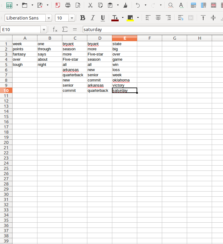
Fortunately I found this site: wordcounter.net.  Probably not its intended use–I began pasting the top football news articles into its form and analyzing their content.  I checked 5 such posts, and compiled their keywords:

The first two articles didn’t have enough meaningful content for a full 10 words

Okay, I could work with this.  This Bryant fellow seems to be a highlight.  I’m sure I could muddle through the rest.

I decided to test my theory on Liz, and texted her the following message:

“I heard that in Bryant’s week one, he scored enough points that it’ll be his big season.  He’ll make a good five-star Fantasy Football pick.  Despite the initial loss, Arkansas will recover with enough victories to stay in the running.”

Liz responded:

“What are you reading?”

She was intrigued!  Had I pulled it off?!  I replied, ambiguously:

“Just the highlights.”

She validated my success by sending me an unrelated photo of a dog that was up for adoption.

…Okay, maybe my method needs a little refinement.  Maybe I can pull a larger sampling of articles and write a formula to analyze the character strings.

Or maybe, just maybe…when I tell you I don’t watch football you could stop talking to me about football and I wouldn’t have to design a logic-based analysis of textual media to formulate responses to your banal and pointless rambling.  Now quit hogging the coffee machine.

–Simon