I have 3 monitors up currently, running at maximum resolution and with the sizing adjusted to cram as much information as possible onto these screens without feeling eye strain. I casually peruse the internet. Every tech site I visit has followed a similar theme–they’ve used the entire monitor’s real estate for its intended purpose and filled it with information.
Then I visit a blog and there’s large segments of white space and the articles are crammed into tiny columns with large verticality. Now, I do know why, as I’m in the industry and have had experience with web design (I’ve even attended a seminar that touched on this): the human eye is lazy and wants to float through text as comfortably as possible, and varying studies have revealed anywhere from 45-70 characters per line to be the most comfortable. And to this I say quite frankly: bollocks.
I can’t remember the last book I read, aside from a children’s story, which adhered to this philosophy. Oh I know the argument has been that paper reads differently from digital, which has also been the primary argument in the running debate regarding deprecating serif fonts; but how lazy are we really when we want to read something of interest? Personally, I don’t find it all that difficult to adjust to varying font sizes and widths, and my eyes are far from 20/20. I do find it irritating, however, to have to continually scroll down a page as I read.
It was a lingering gripe I had with this default WordPress theme, that it was capping content width at around this 75-character mark, and no obvious means existed by which to adjust it. The whole point of using an authoring program like WordPress was to not have to dig into code to add content and make changes. Adding to that, it’s much more difficult to dig into code that someone else made than it is to modify my own, so this issue is doubly aggravating. Further still, each version of WordPress and each separate theme has different settings, so consulting the usual Internet discussion was fruitless.
No matter, it’s all CSS after all. How hard could it be?
As it turns out, it’s relatively easy to make the change. The difficult part was finding the styling info I needed. But thankfully, WordPress not only has an engine for modifying the stylesheet within WordPress itself, they were kind enough to also have left a comment trail throughout. I found what I was after in a little section called Layout.
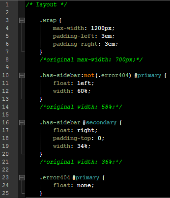
“.wrap” encompasses anything under that umbrella, and after experimentation I found that 1200px made much better use of a full desktop monitor without overloading visual elements. Then I adjusted the percentile ratios of “#primary”, the main content column which contains posts, and “#secondary”, all that sidebar stuff to the right. Above are my changes.
Like all web design, visual layouts are trial and error, and I may tweak things more in the future. But for now, I find the posts’ width to be much more practical. And now my embedded images appear bigger as well.
I’m sure much of this is personal preference, but I really hated wasting all that space. Whether or not anyone else might agree with my assessment, at least this post shows the means by which it can be changed to suit other’s needs.
–Simon